On a busy workday managing the catering at Amsterdam Arena, I met a Ukrainian family who had fled because of the war. This encounter was the final push for me to choose this topic and project, as I had long been inspired to help people in need.
My Role
The foundation Ukrainians in the Netherlands offer various forms of assistance to war victims and needs financial support. On behalf of this foundation, I research and design a way to create more trust and financial support for them.
Deliverables
Problem & stakeholder analysis, ideation, LoFi to HiFi Prototyping.
Design Challenge.
"How can an interactive digital product help the foundation Ukrainians in the Netherlands receive more donations, with a focus on young adults?"
Problem analysis.
With deep research in issues about online donation and non-profit organizations I came up with 5 key problems:
- The purchase report is perceived as confusing and unappealing.
- Donations on the website are not possible.
- There is lack of engaging communication with donors.
- The intrinsic omtivation of donors is not effectively addressed.
- Web design principles are not applied properly.
The 5 key problems
Not possible to donate through the website. Not user friendly.
A confusing and unappealing purchase report
No engaging communication with potential donors.
Lack of addressing the intrinsic motivation.
UX design principle aren't applied.
By adding up all the subproblems, I started designing a new interactive product where gaining trust and triggering intrinsic motivation are the focus points.
Stakeholder Analysis.
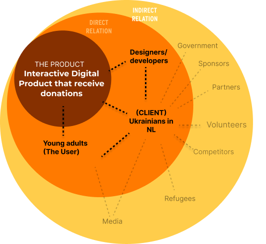
After setting up the Design Challenge, I set up a Stakeholder Analysis to map out the most important stakeholders and their wishes and needs.
Methodics
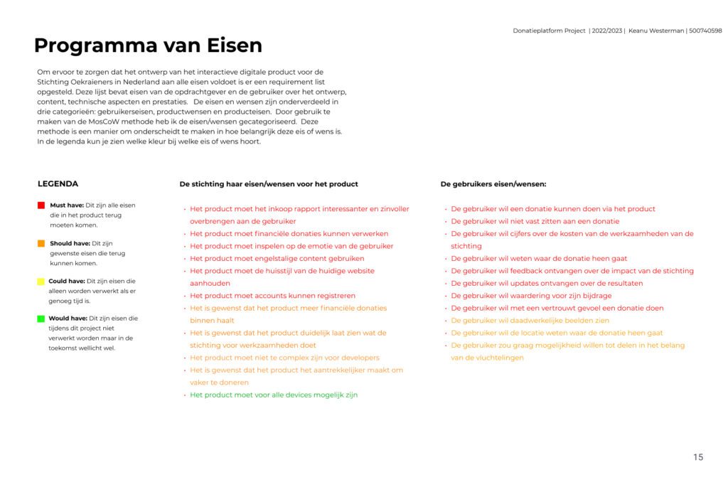
Using methods Survey, Interviews, Best Practices and Focus group, I could set up goals and wishes in a Requirement list.
The primary focus on myself as the designer, the foundation as the client and young adult donors as users shapes the focus for this project.
I’ve categorized the requirements for users and clients using the MoSCoW method: Must have, Should have, Could have, and Would have. This provides a clear framework for designing the solution to the challenge.
Main goals
- The product must appeal to the user’s emotions
- The products provide information where donations are going and how they are spend
- The product needs to show figures on the costs of the foundation’s operations.
- The product must express gratitude for each donation.
3 Ideas.
Using methods as ‘How can you…’, classical brainstorm sessions, sketching and scenario mapping I combined three ideas to choose a final concept.
Idea 1
1 Immersive storytelling
Using methods as ‘How can you…’, classical brainstorm sessions, sketching and scenario mapping I combined three ideas to choose a final concept.
Idea 2
2 Direct Chat with refugees
Due ethical reasons this idea was interesting but not responsible.
Idea 3
Redesign of the current website
For me as a designer I like to challenge myself, I didn’t think this was a challenge enough for me to finish my study.
Ultimately, a combination of the three ideas is the most interesting way to reliably and motivatingly convince the target audience to donate.
The prototype.
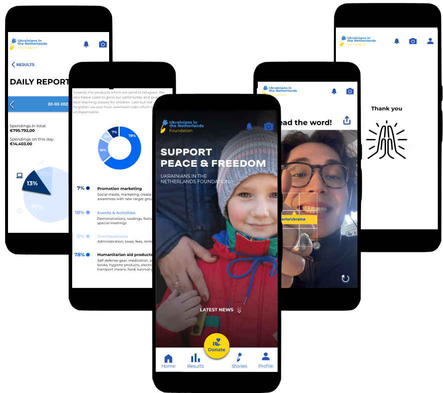
The Progressive Web App for the Ukrainians in the Netherlands Foundation is an affordable way to build trust with young adult donors and encourage donations. It communicates the foundation’s activities, demonstrates the impact of donations, provides appreciative feedback, and offers updates to secure financial support.
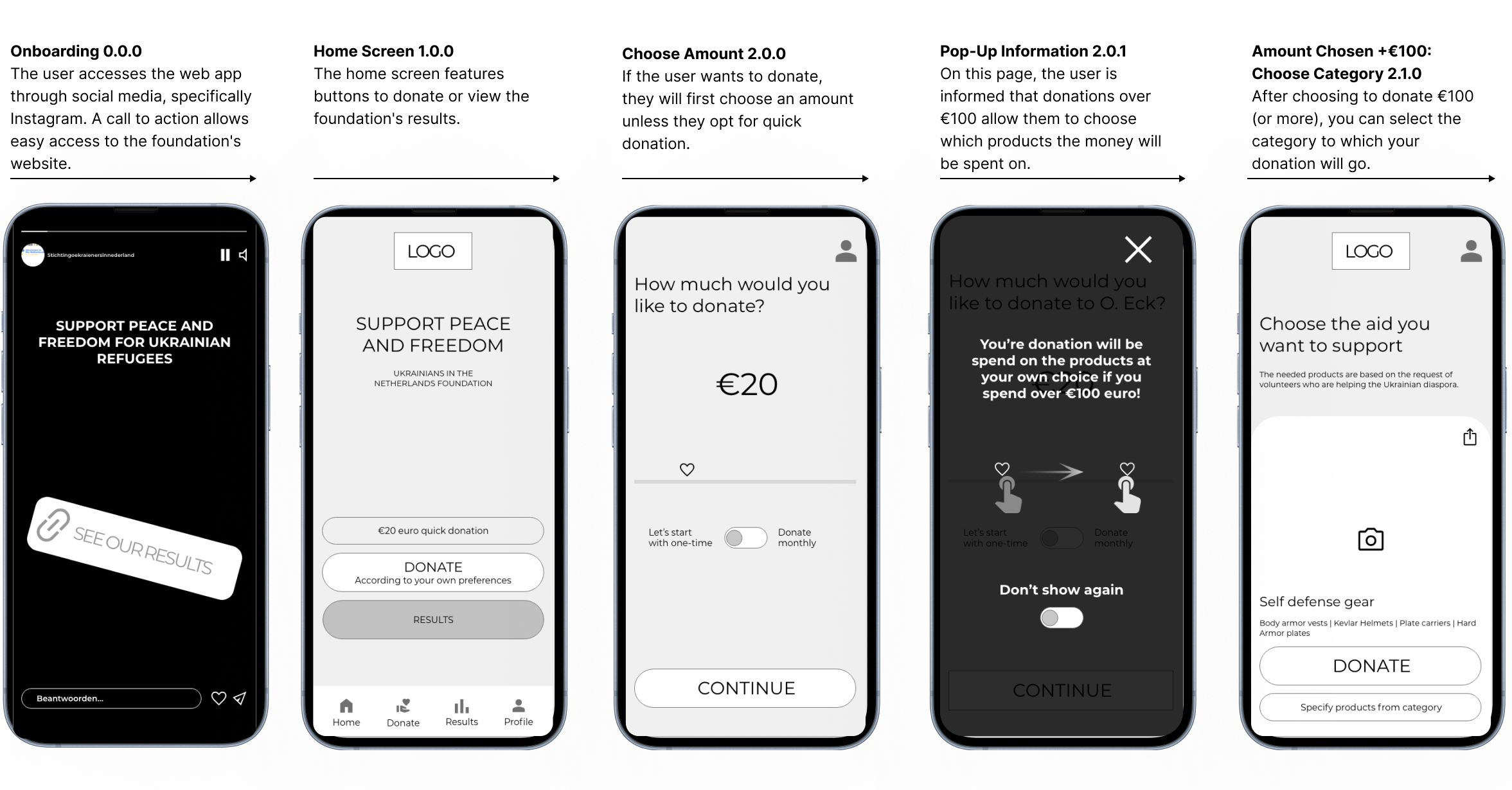
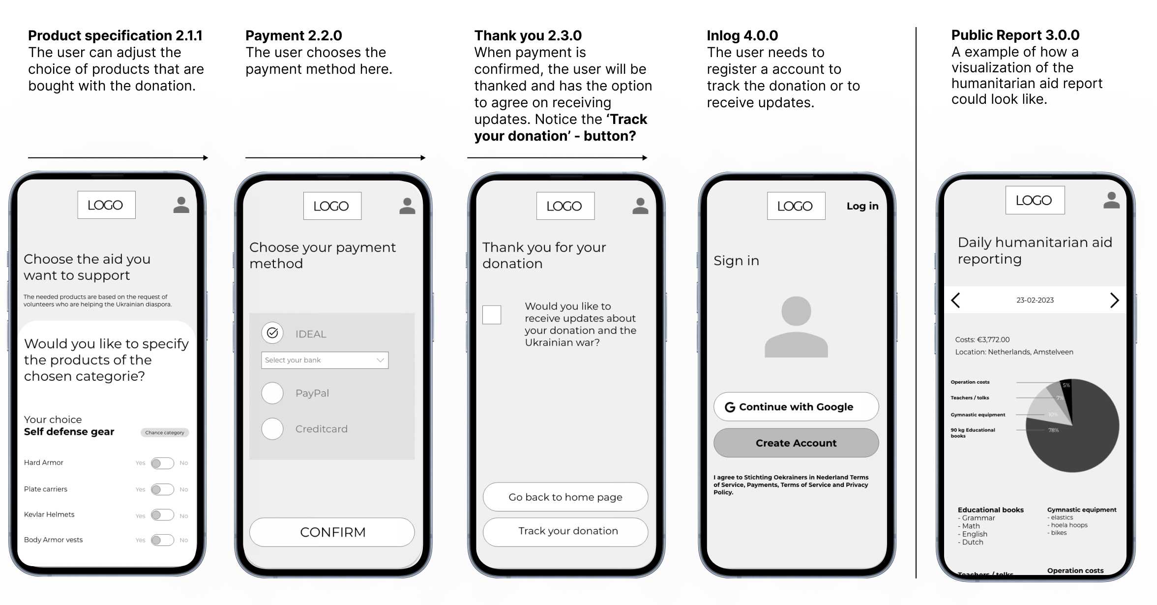
Lofi.
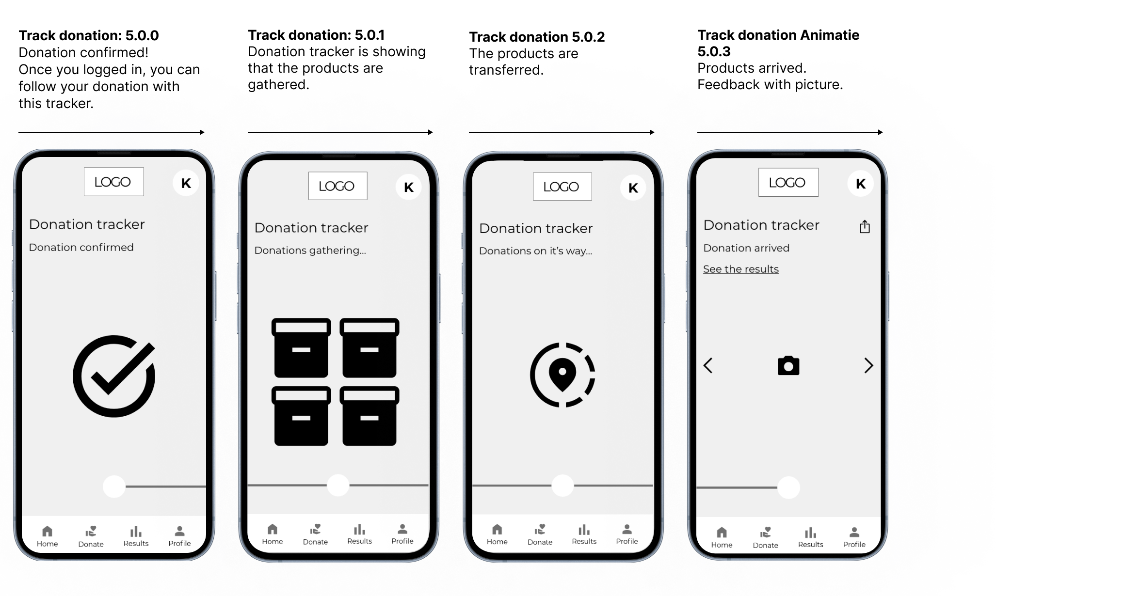
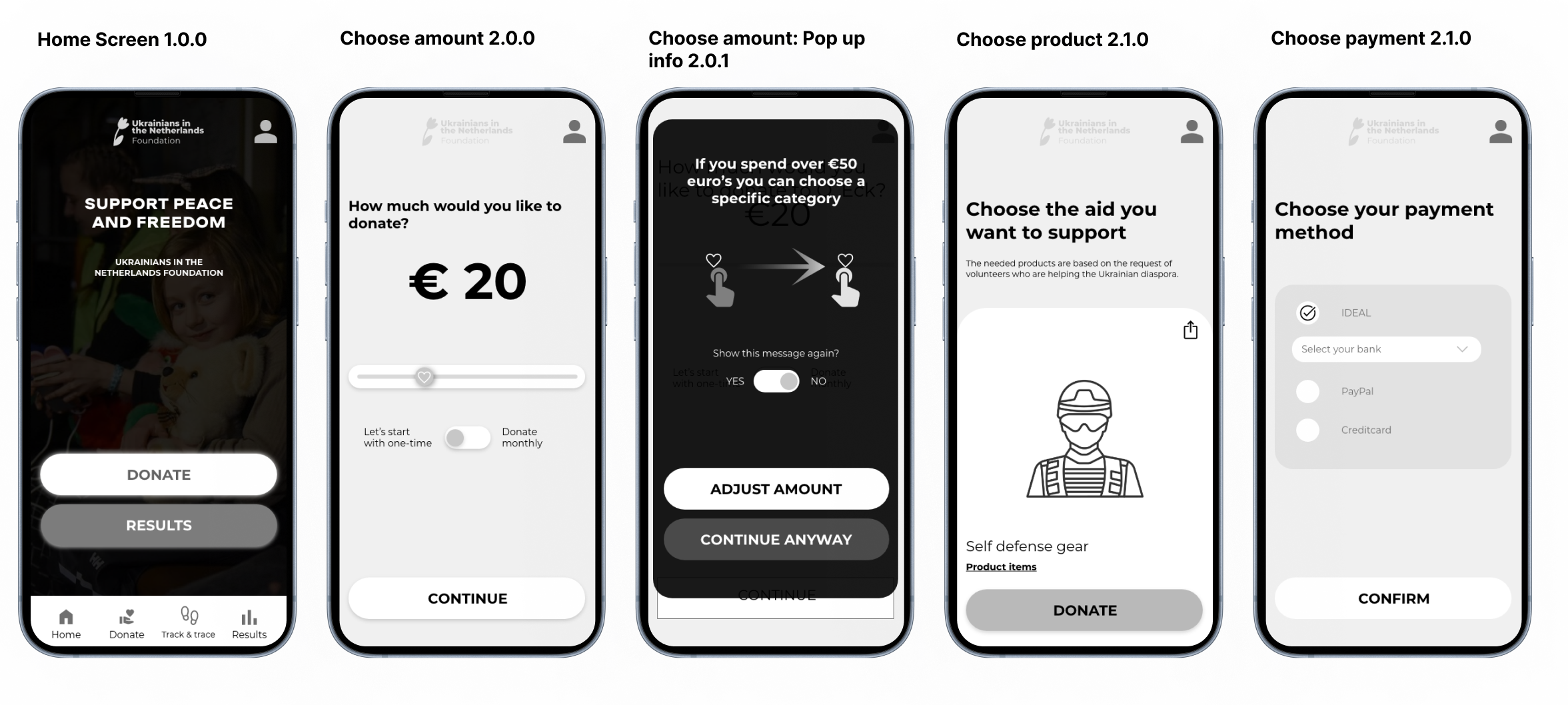
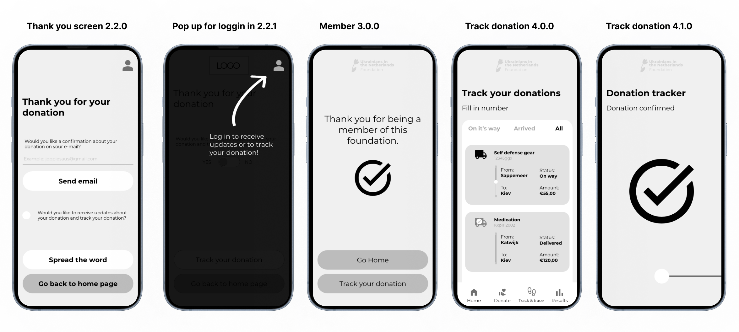
Flow of choosing products that your donation is spend on. The idea of this is to give the user autonomocy over their donation. If the user spends over €100 euro, you can choose the products that you want to donate for.
LoFi to MidFi
Feedback Implementation
Based on the LoFi prototype test results, the three donation buttons caused confusion, the 100 euro option was too high, the exact product choice was unnecessary and the daily report caused an information overload.
Using 2 buttons for 2 seperate actions instead of using 3 buttons brings less confusion.
A minimum of €100 euro was too high. I reduced it to €50 euros for choosing a category.
Information overload is solved with data which interacts with buttons.
MidFi.
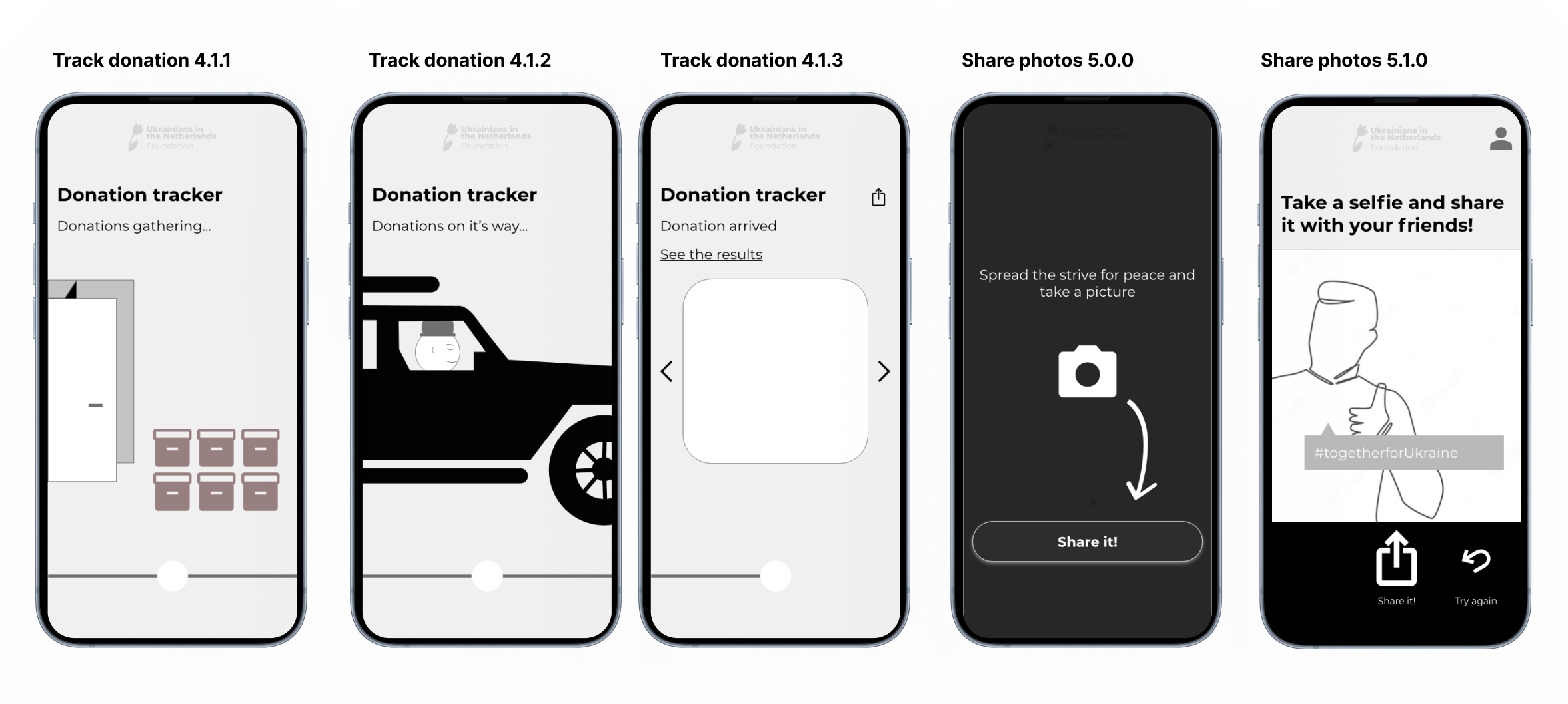
Creating a new prototype that is Midfidelity with implemented feedback from the Lofi prototype, more visuals and new functions.
MidFi to hifi v1
Feedback Implementation
Before starting the HiFi prototype, I re-evaluated my goals and how to convey key elements like transparency and communication to donors. Functions like track and trace and category-based donations were removed and replaced with new, compelling methods to encourage donations.
HiFi V1.
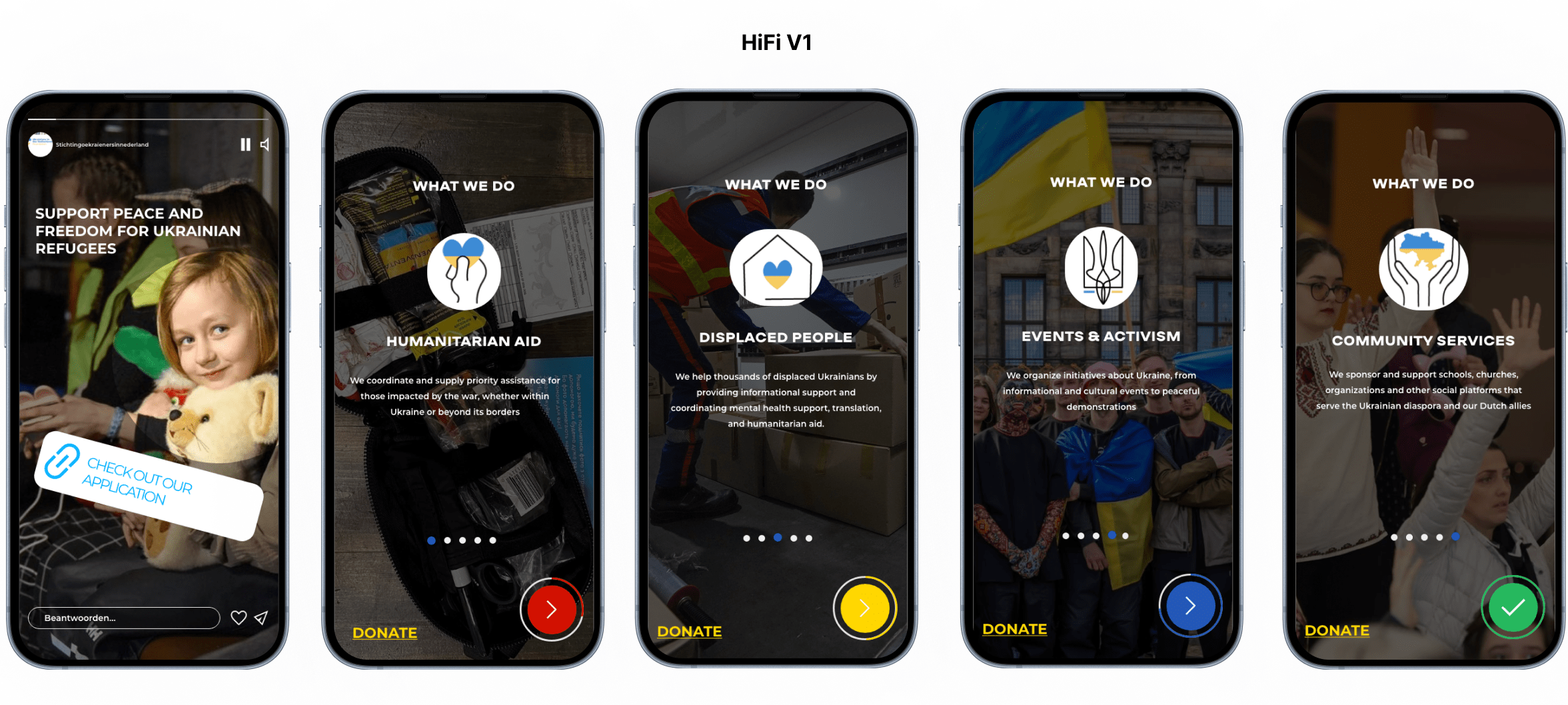
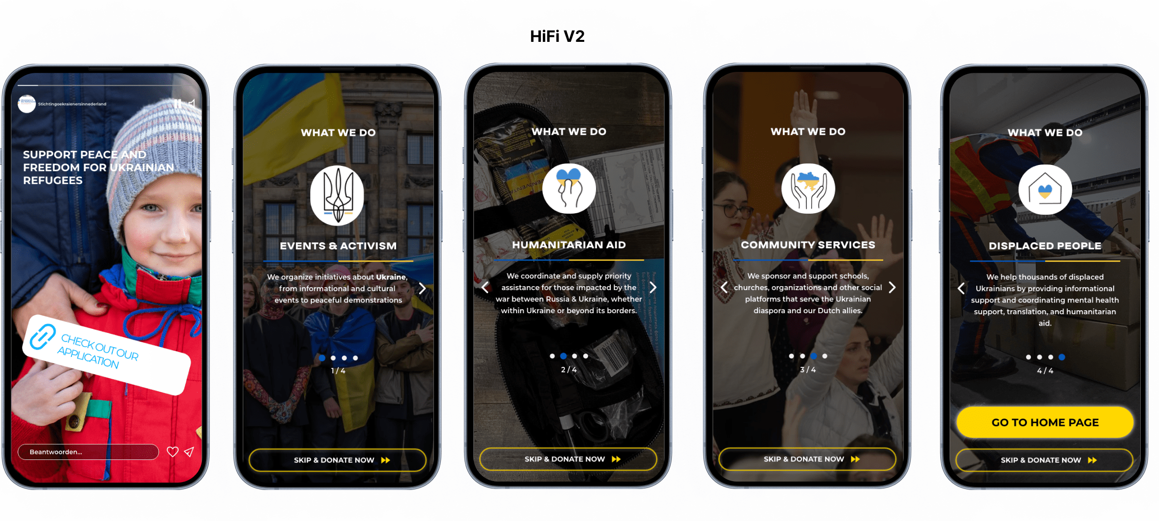
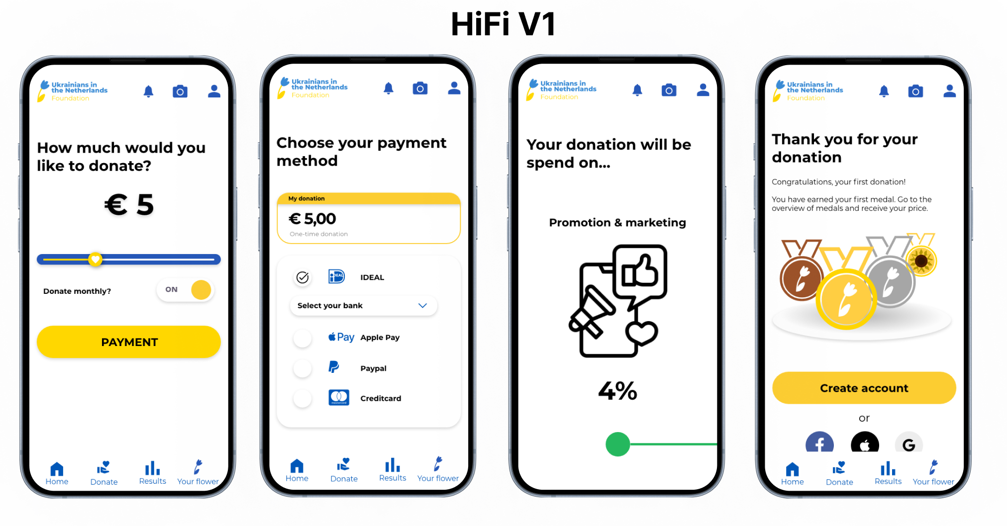
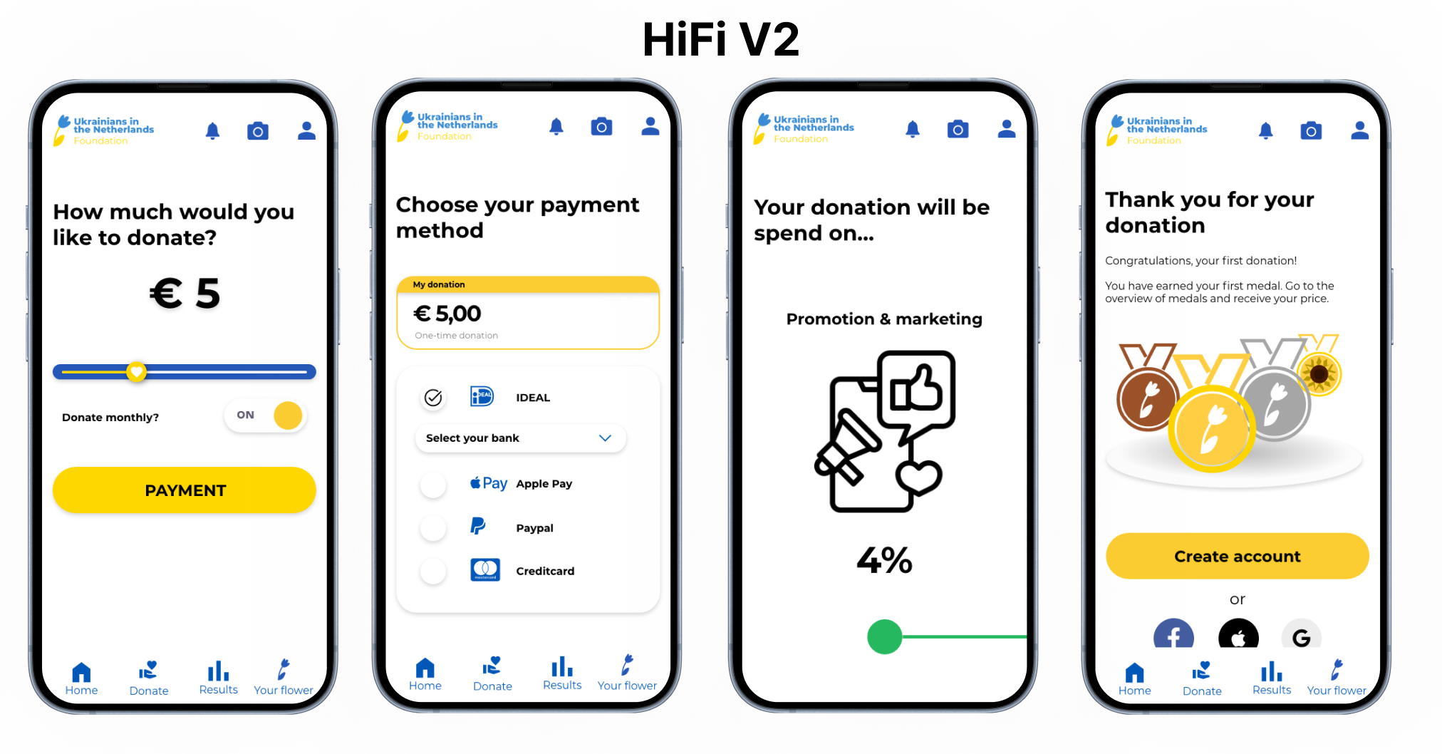
Within the process of the HiFi prototype there were 3 iterations based on the onboarding, emotional encouragement, UX/UI detailed specifications, ethical reasons and new functions. Look at the comparisons of V1 and V2.
HiFi v1 compared to hifi v2
Onboarding
- Improved perceived affordance with a small addition and kept only “what we do.”
- Bottom-right button mistaken for a play button due to YouTube resemblance.
- Intended progress indicator was seen as a timer.
- “Donate” button now clearly skips the explanation.
- Added “1/4, 2/4,” etc., under dots to clarify progress.
- Arrows indicate swipe directions, eliminating the need for a back button.
- Skip button now leads directly to the donation page, enhancing efficiency.
HiFi v1 compared to hifi v2
Making a donation
- Significant improvements were made to the donation process.
- We enhanced forgiveness
- Broke the process into smaller steps
- Increased transparency about fund usage. The endowed progress effect helps users see their progress.
- Images and data on fund distribution are now shown before donating, rather than only after.
HiFi v1 compared to hifi v2
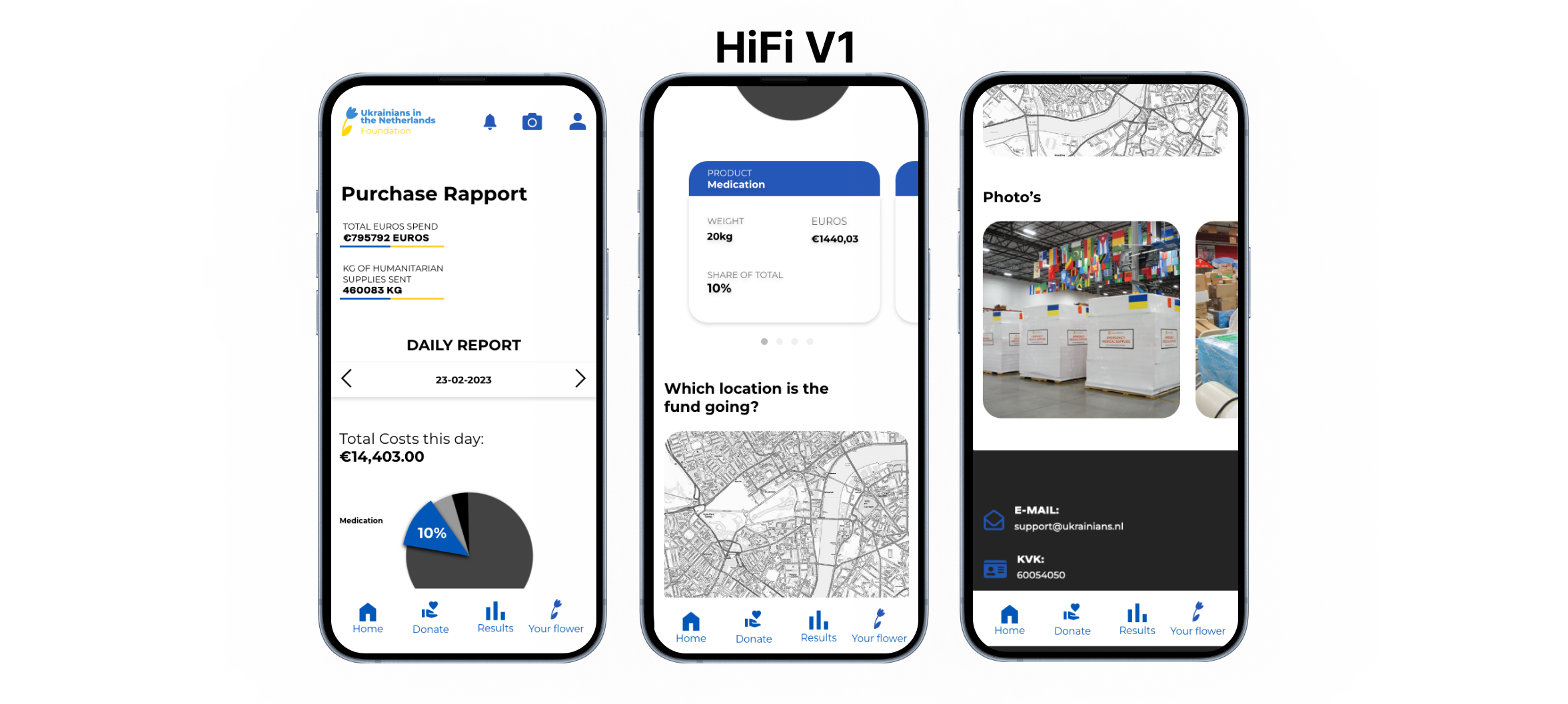
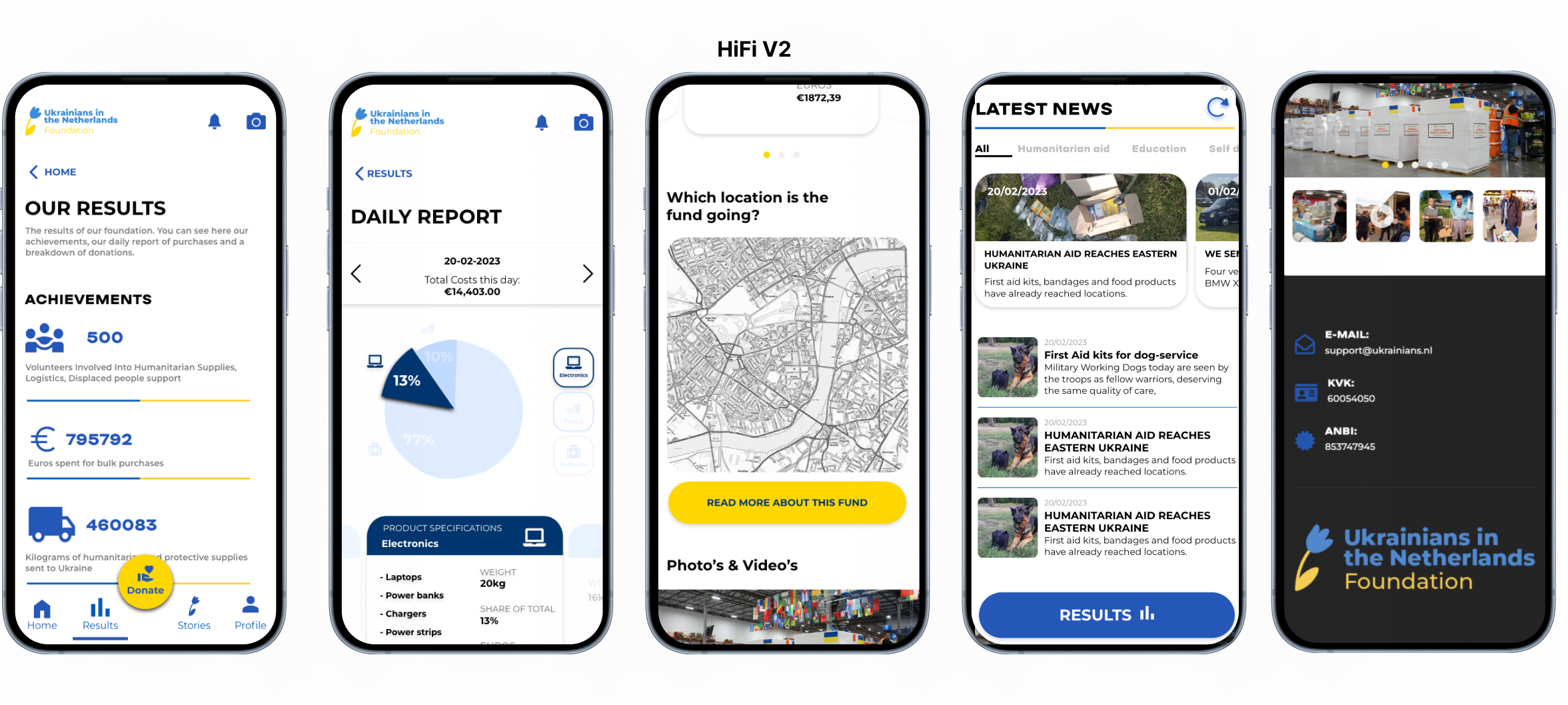
Purchase Report
- The new flow starts with achievements, then the procurement report, highlighting their work’s impact with daily updates, linked news, photos, and videos from Ukraine.
- To make this report more engaging I connect it to achievements, including detailed information, and adding interactive elements. Users can now toggle between products using buttons, swipe through the overview, and click on the pie chart to select a product.
HiFi v1 compared to hifi v2
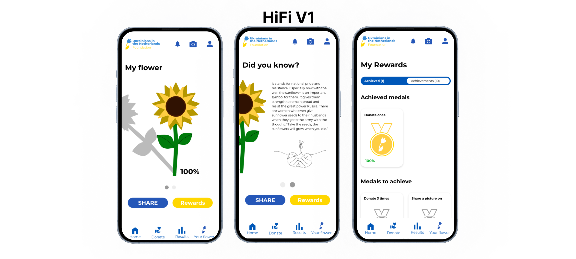
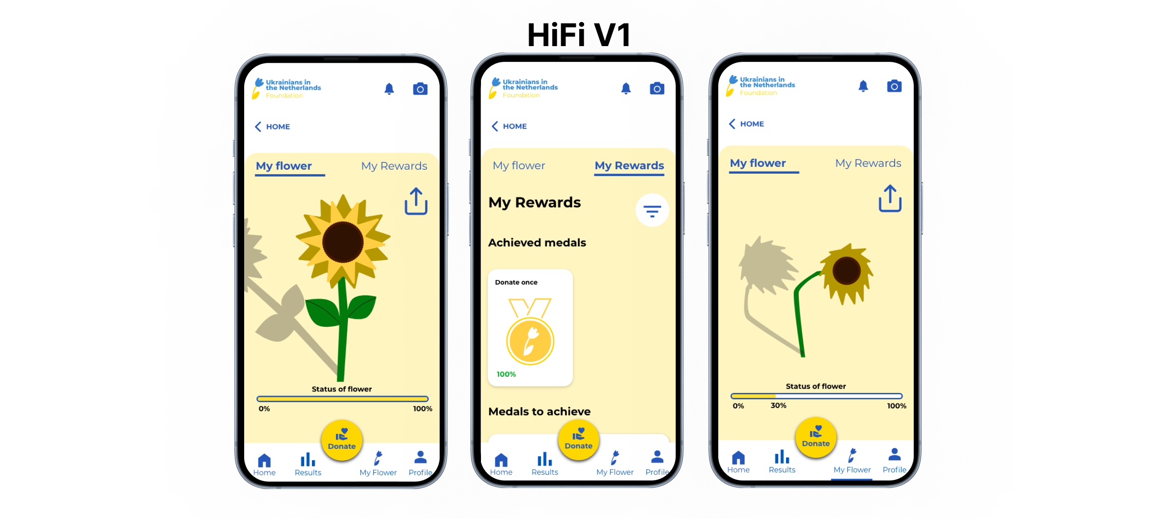
Gamification: Keep the flower a live
- To motivate users, a sunflower explanation at login boost actions supporting soldiers.
- Persuasion techniques like sympathy and commitment encourage donating and sharing messages.
- Forgiveness allows skipping lengthy explanations, while a progress bar indicates the flower’s status, improving visibility.
The final version
HiFi V3
In this final version you can see improvements in the start screen, onboarding now includes key donor info, the procurement report is more effective, donation breakdown is easier to find, and donation process navigation is enhanced.
